Configuring the knowledge graph widget
Introduction
Funnelback knowledge graph ships with a widget that provides a browsable and searchable view of the knowledge graph.
Before you start
A knowledge graph must be built for the collection/profile combination and the profile must be configured as a frontend service.
Customisation of the widget labels and templates should be made on the frontend service that delivers the knowledge graph to the end user. If a meta collection is used to deliver a graph that spans a number of different collections then the widget customisation should occur on the meta collection.
Overview of the knowledge graph widget
Funnelback includes a widget that can be used to interact with the graph. The widget can be integrated into existing websites or used as a standalone tool.
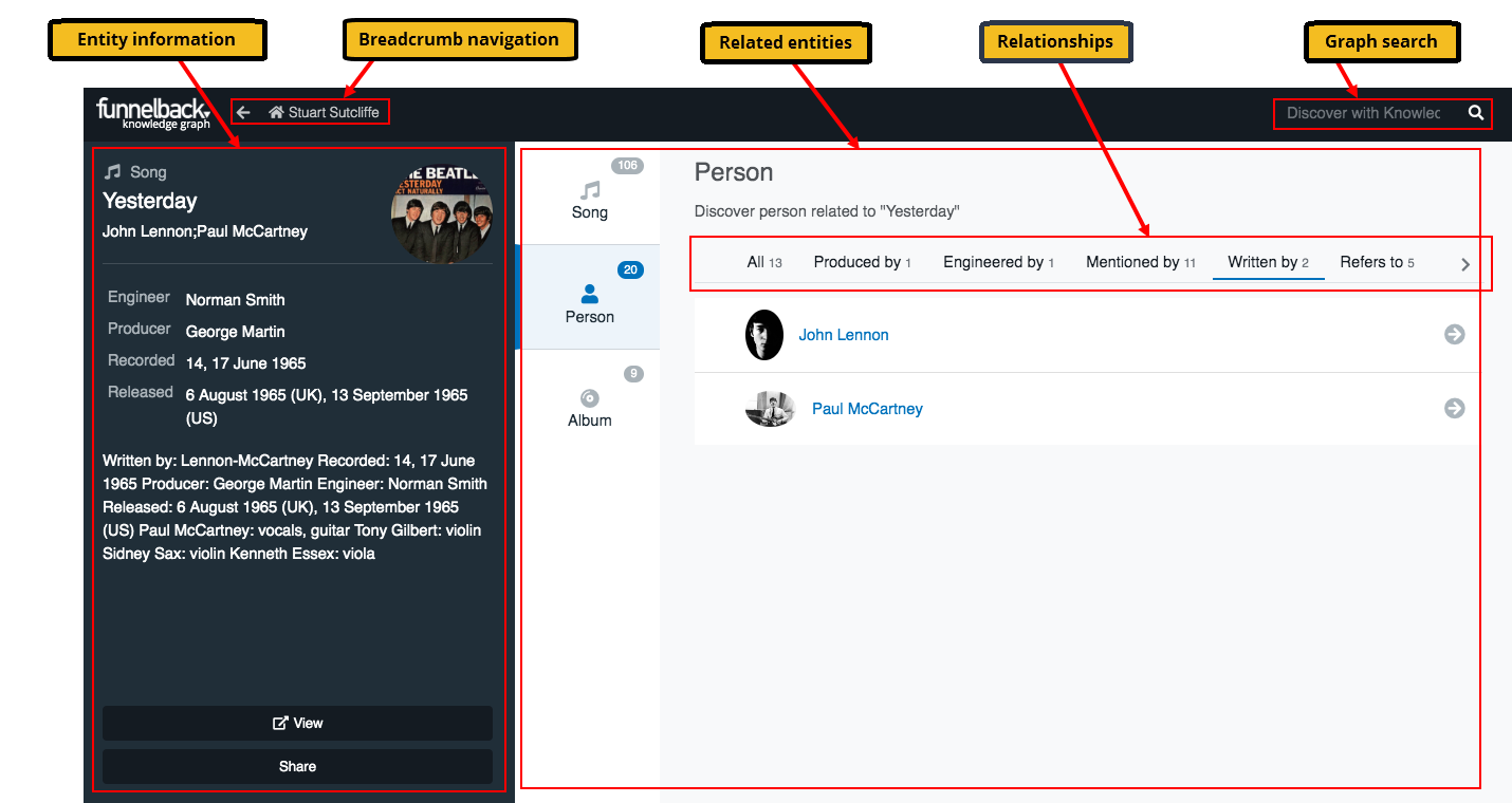
The diagram above is an example of the widget displaying an entity. The widget consists of a number of regions:
- Entity information: This is the information view of the currently selected entity and includes a number of configurable fields which are all sourced from the entity's fielded properties (which are sourced from underlying metadata in the source content).
- Related entities: This panel presents other entities from the knowledge graph that are related to the currently selected entity. They are grouped by entity type (the central column containing the song, person and album values).
- Relationships: The related entities are sub-grouped by the relationship. The tabs include both mentions and user-defined relationships.
Traversal of the graph is achieved by clicking on the related entities, by running a graph search, or using the widget's breadcrumb navigation.
Customising the widget
The administration interface allows customisation of the widget in two ways:
- Customisation of widget labels: allows an administrator to set human-friendly labels to display to the end user for the entity type, metadata property field names and relationship names that are set up on an entity that are displayed in the widget.
- Customisation of the widget templates: allows an administrator to control what is displayed for each entity when it is returned in the knowledge graph widget.
Configuring the widget labels
The display name of entities (and their associated properties/metadata) and relationships of the widget can be set using the UI labels configuration screen which is accessed via the graph tab in the administration interface.
The label editor allows the following categories of labels to be changed:
| Category | Description | Example |
|---|---|---|
Metadata |
The display labels of each metadata of an entity | Metadata class a is to be displayed as Author. |
Relationships |
The display label of the custom relationships | If a ActedIn relationship was created between an actor (source) and a movie (target), the outgoing label is Acted in and the incoming label is Cast member. |
Type |
The display name for each entity type | wordDocument is to be displayed as Microsoft office word document. |
Configuring the widget templates
How an entity is displayed in the widget is controlled using the widget template editor.
The UI templates editor screen, accessed from the graph tab in the administration interface, enables an administrator to control what is displayed for each type of entity.
The UI template configuration screen provides the ability to configure the different presentational aspects of knowledge graph widget which includes:
- Main display - How each entity type is to be present when it is in focus.
- List View - How each entity type is presented when it appears as a related entity.
More information can be found within the inline help of the UI Template configuration screen.
A single template can be defined for each available entity type. It is possible to define a default template that will apply to every entity type without defined specific template.
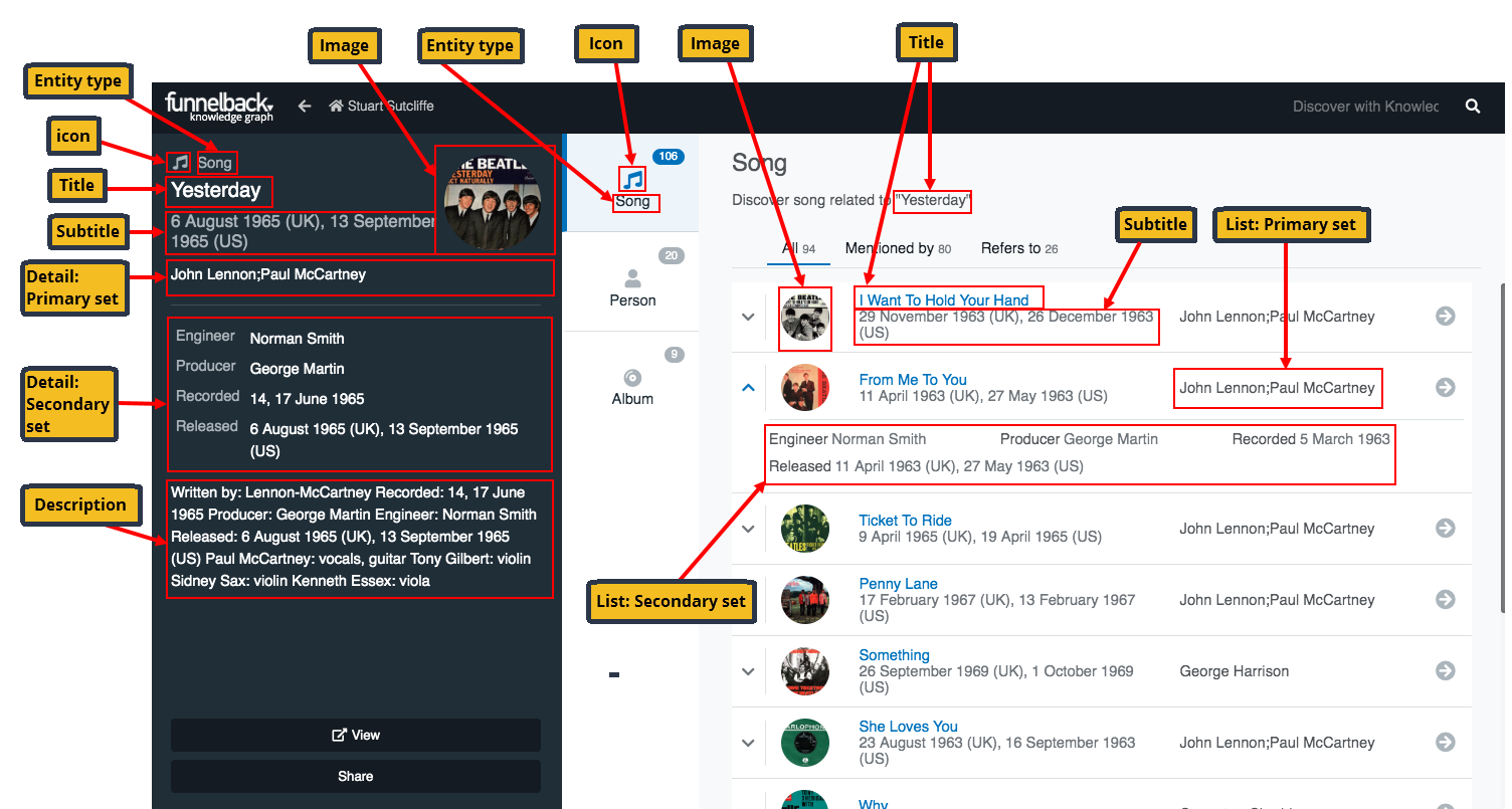
The labels in the diagram below show the 'fields' that can be configured on the UI templates editor screen. The highlighted information is sourced from the value of the field as configured on the UI templates editor.
-
Entity type: Drop down menu allowing section of the entity type that the template applies to.
-
Icon: Defines the icon to use for the entity. By default the widget is configured to display icons from the FontAwesome 5.7.2 free icon set. To use the FontAwesome icons specify the icon name as the value of this field.
The value specified in the
iconfield is appended to theiconPrefixconfiguration parameter that is defined in the jQuery that adds the widget to your web page. The widget can be configured to use other icon libraries or do other things that are controlled by CSS that will need to be configured. See the knowledge graph frontend for further information.Example using Font Awesome and the icon name
This uses the icon's name which sets a partial CSS classname that is appended to the default icon prefix.
Within the template here, you would set:
icon: skyatlasThe default widget configuration contains:
	jQuery(document).knowledgeGraph({
	  ...
	  iconPrefix: 'fa fa-fw fa-'
	});
These two values are combined so that the CSS selects the correct icon.
To configure the icon display using a full CSS classname requires setting the
iconPrefixto an empty value.iconcan then be set to something likefa fa-fw fa-skyatlas -
Title: Defines which metadata class should be used to source the
titlevalue in both the detail and list views of the widget. -
Subtitle: Defines which metadata class should be used to source the
subtitlevalue in both the detail and list views of the widget. -
Description: Defines which metadata class should be used as a source for content describing this entity. The text will be displayed in the description section of the widget's detail view.
-
Image: Defines which metadata class should be used to source a URL that will be used as the image in both the detail and list views of the widget. If no image is specified this will default to the value of the Image metadata class.
-
Detail - primary set: Defines the set of metadata classes to be displayed as the main properties in the detailed view.
-
Detail - secondary set: Defines the set of metadata classes to be displayed as the secondary properties in the detailed view.
-
List - primary set: Defines the set of metadata classes to be displayed as the main properties in the list view. The order of the fields here will be reflected in the widget.
-
List - secondary set: Defines the set of metadata classes to be displayed as the secondary properties in the list view. The order of the fields here will be reflected in the widget.
-
List sorting: Defines which metadata class will be used for sorting of items in the list view, and if they are sorted alphabetically (A-Z) or reverse alphabetically (Z-A).
Configuring the widget search filters
The search filters displayed in the widget are configured using the faceted navigation editor for the profile.
The order of the filters is determined by the order of the faceted navigation within the JSON configuration file.
Advanced configuration
Integrating the widget
The knowledge graph widget can be included directly on any website or web application through the inclusion of javascript and style sheets. Detailed steps can be found on the knowledge graph frontend section.
Viewing the knowledge graph
To preview knowledge graph, open the administration user interface, navigate to the Graph tab and press the Browse Knowledge Graph button. Alternatively, it can be previewed directly using the following url:
http://<FUNNELBACK-SERVER>/s/knowledge-graph/index.html?collection=<COLLECTION>&profile=<PROFILE>